Nedko Chulev
Well-Known Member
Hello everyone,
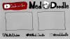
I've recently changed my schedule on my channel and have also decided to swap out most of the channel art. I have also created an intro and outro for my videos and I'd be more than happy to hear what you think about them and give me any advice you might have.
I'm uploading 2 still images of my new intro/channel art and outro but you can watch the animated versions on my latest video.
Thanks")
I've recently changed my schedule on my channel and have also decided to swap out most of the channel art. I have also created an intro and outro for my videos and I'd be more than happy to hear what you think about them and give me any advice you might have.
I'm uploading 2 still images of my new intro/channel art and outro but you can watch the animated versions on my latest video.
Thanks