Which type of Thumbnail is better for a Let's Player?

Pat Simmons

Well-Known Member
Please read the entire article
Is a live frame from each video better? or is the more artistic kind better? i.e.
This:
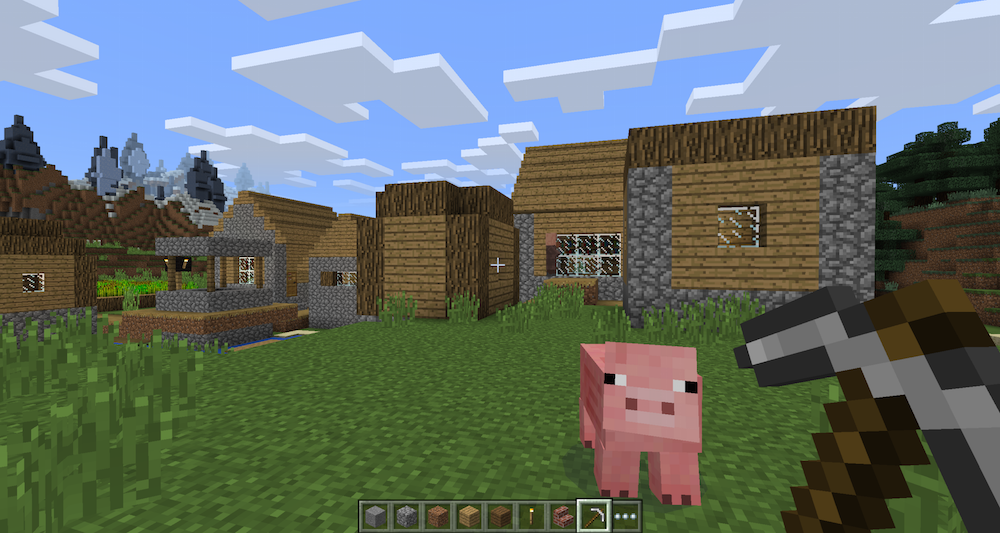
Minecraft_Win10_Beta_-10.png

Versus
This:
minecraft-1.jpg

And I mean as the background for the text and other overlays one uses.
What I'm looking for is what draws people in the most, not how easy one is to work with than the other.
Thanks!
 
Unless something very interesting is happening in the live frame, I tend to like the artistic frames much more~
 
I'm personally a fan of consistency with thumbnails so viewers can easily distinguish your videos from others in the recommended bar. For example with our we always have a green background and then just change the text and image each time.


Between the two options presented though i'd say artistic. Screenshots from gameplay generally look lazy and don't really catch the eye.
Ironically though working with screenshots from gameplay takes more work than just overlaying your text on the art.
 
It is usually preferred to have an artistic, or an edited thumbnail, since it usually looks much more professional.
 
The more artistic one is better in my opinion. There are a lot of channels that will take a screen shot but if you go out of your way to change it up and find a specific picture that matches your video, I would personally be more inclined to check it out!
 
Back
Top