
You are using an out of date browser. It may not display this or other websites correctly.
You should upgrade or use an alternative browser.
You should upgrade or use an alternative browser.
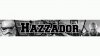
Is my new banner bad?
- Thread starter Hazzador
- Start date




TheDutchTexan
I Love YTtalk
The text gets hidden in the new one, but it looks a whole lot cleaner. It's up to you what you want to do with it. Perhaps make the letters green again and see what it looks like? I think text needs to POP!

ProductionPeople1
I Love YTtalk
I like it! Really like the stormtrooper helmet!

Hazzador
I Love YTtalk
The background is better in the new one that's for sureThe text on the old one looks better but the background is better on the newest one.
 [DOUBLEPOST=1442575907,1442575889][/DOUBLEPOST]
Thank you![DOUBLEPOST=1442575935][/DOUBLEPOST]I like it to be honest. Really nice stuff.
Thanks for the feedbackThe text gets hidden in the new one, but it looks a whole lot cleaner. It's up to you what you want to do with it. Perhaps make the letters green again and see what it looks like? I think text needs to POP!


MusicForTheDay
Liking YTtalk
In my opinion you should perhaps use some gradients or glows on the text to make it more popping in the banner
Also have a slogan that explains your channel in a single line or a few words somewhere on the banner. Even better if you can somehow show your schedule
Blurring the background a tad may also help
Also have a slogan that explains your channel in a single line or a few words somewhere on the banner. Even better if you can somehow show your schedule
Blurring the background a tad may also help

Shendijiro
(┛ಠ_ಠ)┛彡┻━┻
Moved to reviews and channel feedback