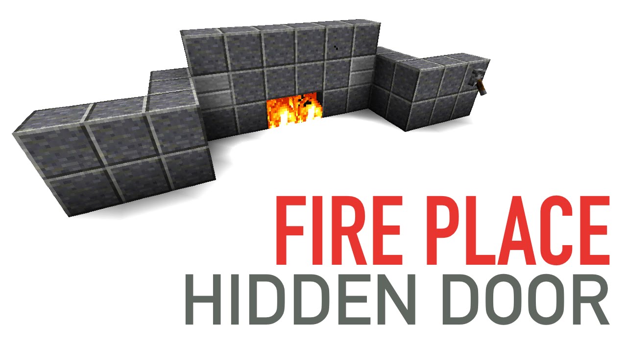
Rails2Revolution
Super Poster
Yo Carlo!
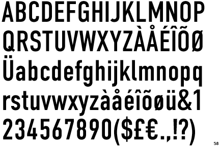
Go for condensed and bold fonts. You tend to be able to get the most readable..ness in a thumbnail with the boldness and the condensed...ness makes it easier to fit your whole text in the thumbnail without it taking up too much horizontal space.
My personal recomendation is DIN Condensed and DIN Alternate. Extra light fonts like Quicksand can also be nice but are often to thin to see in a tiny thumbnail.
Here's some of DIN Condesed and Alternate for you to ponder over:


(Btw how on earth do we resize images on here? xD)
Hope that helps ya out! I personally love this font and always end up coming back to it
- Joel
Go for condensed and bold fonts. You tend to be able to get the most readable..ness in a thumbnail with the boldness and the condensed...ness makes it easier to fit your whole text in the thumbnail without it taking up too much horizontal space.
My personal recomendation is DIN Condensed and DIN Alternate. Extra light fonts like Quicksand can also be nice but are often to thin to see in a tiny thumbnail.
Here's some of DIN Condesed and Alternate for you to ponder over:
(Btw how on earth do we resize images on here? xD)
Hope that helps ya out! I personally love this font and always end up coming back to it
- Joel
")