FantasyGamerX
'Cause Grades.
DISCLAIMER: I am in no way a proffesional. I've been lightly using Photoshop for 6 months now, and have gotten WAY better than I was in the beginning. I just wanna share with you, the steps I take to make my banners. If you wanna see the difference here's a before and after-
BEFORE-

It's just a gradient with some words and a picture. Now I'm making things like this-
(this is just a work in progress, haven't finished it yet )
)
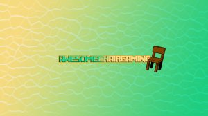
and this-
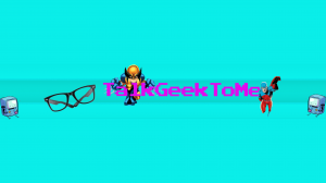
Okay so the first step is you'll need a template. This is obvious, that way you know where to put your stuff! I personally use this one-
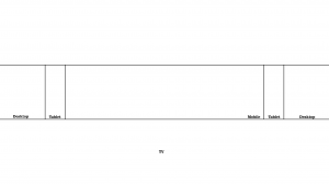
So first I start with what goes ON the banner, positioning it on the template. Then I move on to the background.
For the text, pick a nice font, maybe one that fits your channel or one that just looks nice. Make it a color that looks good with the background. Then, depending on the banner, you may choose to add effects to it such as drop/inner shadow, drop/inner glow, bevel and emboss etc.
Another trick and I actually used this on the first one is to duplicate the layer and apply motion/gaussian blur to the bottom layer to add a nice effect to the top text.
Now that you have your text, you should go get some pictures or SOMETHING to add some spice to it. Position them the way you want them on the template. Some tips-
Don't be afraid to overlap. I used to have everything in it's separate place they would never touch each other. Not only does it look nice, but you can fit more stuff!
Symmetry is a great idea if you have empty space. Use Edit>Transform>Flip Horizontal to flip an image and then drag it to the other side of the picture
So that's your text and pictures. Now onto the background.
So the first step is I create a new layer on top of everything. I pick a color combination and then make a gradient. I use different kinds of gradients, some are linear, some are radial etc.
Now this is where the magic happens. Two things will get your banner looking awesome-
FILTERS AND BLEND MODES
With those you can spice anything up! You have to play around with it. Never stick to your original plan, go with the flow! Try out different combinations of filters and don't be afraid to scrap it. The AwesomeChairGaming banner started out Red and purple. I applied facet pixelate, and some artistic stuff, and then solarized it. It was all black with blue lines. I made the green and yellow gradient and used a blend mode to get the texture from the bottom. I'll get to those in a sec.
For the TalkGeektoMe banner, it started out sea green and cyan. I made one gradient and applied some artistic filters to it. Then I duplicated the layer, moved it around a little bit and blended them.
I did not expect EITHER of them to come out the way they did. Again, go with the flow
I don't really have much to say for blend mode You use it on the layer on top to merge or blend with the layer on the bottom. Play around with it, I usually go through about 5 and pick the best. The ones that seem to work the best for me are- Overlay, Screen, Difference, Exclusion and Darken.
So that's my tutorial. This is just my way, I guarantee you other people have completely different ways to do it, and it comes out just as good if not nicer. Best of luck on your banner endeavors and I'll see ya'll 'round the forums!
BEFORE-

It's just a gradient with some words and a picture. Now I'm making things like this-
(this is just a work in progress, haven't finished it yet
 )
)
and this-

Okay so the first step is you'll need a template. This is obvious, that way you know where to put your stuff! I personally use this one-

So first I start with what goes ON the banner, positioning it on the template. Then I move on to the background.
For the text, pick a nice font, maybe one that fits your channel or one that just looks nice. Make it a color that looks good with the background. Then, depending on the banner, you may choose to add effects to it such as drop/inner shadow, drop/inner glow, bevel and emboss etc.
Another trick and I actually used this on the first one is to duplicate the layer and apply motion/gaussian blur to the bottom layer to add a nice effect to the top text.
Now that you have your text, you should go get some pictures or SOMETHING to add some spice to it. Position them the way you want them on the template. Some tips-
Don't be afraid to overlap. I used to have everything in it's separate place they would never touch each other. Not only does it look nice, but you can fit more stuff!
Symmetry is a great idea if you have empty space. Use Edit>Transform>Flip Horizontal to flip an image and then drag it to the other side of the picture
So that's your text and pictures. Now onto the background.
So the first step is I create a new layer on top of everything. I pick a color combination and then make a gradient. I use different kinds of gradients, some are linear, some are radial etc.
Now this is where the magic happens. Two things will get your banner looking awesome-
FILTERS AND BLEND MODES
With those you can spice anything up! You have to play around with it. Never stick to your original plan, go with the flow! Try out different combinations of filters and don't be afraid to scrap it. The AwesomeChairGaming banner started out Red and purple. I applied facet pixelate, and some artistic stuff, and then solarized it. It was all black with blue lines. I made the green and yellow gradient and used a blend mode to get the texture from the bottom. I'll get to those in a sec.
For the TalkGeektoMe banner, it started out sea green and cyan. I made one gradient and applied some artistic filters to it. Then I duplicated the layer, moved it around a little bit and blended them.
I did not expect EITHER of them to come out the way they did. Again, go with the flow
I don't really have much to say for blend mode
 You use it on the layer on top to merge or blend with the layer on the bottom. Play around with it, I usually go through about 5 and pick the best. The ones that seem to work the best for me are- Overlay, Screen, Difference, Exclusion and Darken.
So that's my tutorial. This is just my way, I guarantee you other people have completely different ways to do it, and it comes out just as good if not nicer. Best of luck on your banner endeavors and I'll see ya'll 'round the forums!


 but when I do I will be a complete noob and I found this tutorial very helpful, but heck I started my summer holidays today so maybe ill make a channel tomorrow, who knows