Cosmic Panda Nearly Fully Out

Status
Not open for further replies.

Michael

I Love YTtalk
Anyone switched their channel over to the new YouTube channel design yet? If you havent already seen it you can switch right at the top when logged into YouTube, I have switched mine over but still need to switch my video to autoplay. Anyone switching over permanently or switched back to the old one?
 
I switched to the new one, I like it a lot, except that some info is hidden behind a 'show more' button, and stuff like that. But I guess they made it so there's more room for the video's on your channel, instead of links going everywhere.
 
I haven't switched yet but Cosmic Panda has grown on me, and by that I mean a panda is growing on my arm. But really, my main complaint now is that it''s hard to view the channel comments and I don't like how everyone's channel is black and grey, more color customization would be great.
 
I haven't switched yet but Cosmic Panda has grown on me, and by that I mean a panda is growing on my arm. But really, my main complaint now is that it''s hard to view the channel comments and I don't like how everyone's channel is black and grey, more color customization would be great.

I couldnt agree more with that, me and my partner were talking about the comments being so hidden away last night but it does seem like it will slow down spam and sub for sub and technically the comments arent that important compared to the videos which do deserve a big portion of the channel, they could have had it one a tab at the top like the Feed tab instead though, that would be out of the way but still easy to find. I agree with the colouring too, I think the top black section should be changeable and perhaps some opacity options added.
 
I'm using it, there's a few things I dont really like but I am sure I will get used to it, overall I like it a lot, it is a vast improvement over the old layout.
 
I couldnt agree more with that, me and my partner were talking about the comments being so hidden away last night but it does seem like it will slow down spam and sub for sub and technically the comments arent that important compared to the videos which do deserve a big portion of the channel, they could have had it one a tab at the top like the Feed tab instead though, that would be out of the way but still easy to find. I agree with the colouring too, I think the top black section should be changeable and perhaps some opacity options added.

Yeah, some more customization options would be nice. The color doesn't really bother me though, make the video thumbnails colorful and they'll stand out more :)
 
Yeah, some more customization options would be nice. The color doesn't really bother me though, make the video thumbnails colorful and they'll stand out more :)

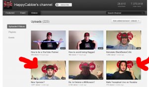
Oh thats something else I dont like so much, have you seen how bad they make people look?
 
For example a few of these thumbnails from the HappyCabbie's Channel look odd to me:

happycabbie.jpg

If you watch the video the thumbs are odd on you will notice it never appears that way.
 
I couldnt agree more with that, me and my partner were talking about the comments being so hidden away last night but it does seem like it will slow down spam and sub for sub and technically the comments arent that important compared to the videos which do deserve a big portion of the channel, they could have had it one a tab at the top like the Feed tab instead though, that would be out of the way but still easy to find.
Good point, I guess the channel comments are more for the owner of the channel anyway.
 
Status
Not open for further replies.
Back
Top