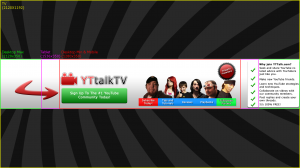
[Concept] YTtalk banner

I like it.. but! I think you should try and remove the white behind the presenters so it also has the gradient :) and either have the badge for the presenters or the text, not both :)
 
I like it.. but! I think you should try and remove the white behind the presenters so it also has the gradient :) and either have the badge for the presenters or the text, not both :)
Aha yes I didn't even notice the white background and wasn't sure whether to make the badge - I didn't even know how to make it before I did this so I just made it to see if I could. Probably shoulda removed the text anyway though, thanks! ^_^
 
Aha yes I didn't even notice the white background and wasn't sure whether to make the badge - I didn't even know how to make it before I did this so I just made it to see if I could. Probably shoulda removed the text anyway though, thanks! ^_^
anytime, I think it looks really nice btw.. but one last thing. The list on the left hand side.. if you have a smaller resolution then the max size, you either won't see the list you will only see the right side of it, not sure what you could/can do about this. Just thought I would throw that in there :)
 
anytime, I think it looks really nice btw.. but one last thing. The list on the left hand side.. if you have a smaller resolution then the max size, you either won't see the list you will only see the right side of it, not sure what you could/can do about this. Just thought I would throw that in there :)
Yeah I thought about that but I didn't want to make the middle squished and I didn't want only TV users to be able to see it so I just put it there... if users want to see it then they'll just have to use a PC or get a bigger monitor! :p I could've taken out the ticks for tablet users I guess...
Thanks again for the feedback guys.
Here's the image with the areas on it (and no white background/presenter txt!)
_PV-YTtalk-areas.png
 
Nice.
Although I would make the edges of the banner blend into the background a little more, and make the solid colour of the banner slightly transparent, just so it all blends a bit better rather then looking like complete separate entities.
 
Yeah I thought about that but I didn't want to make the middle squished and I didn't want only TV users to be able to see it so I just put it there... if users want to see it then they'll just have to use a PC or get a bigger monitor! :p I could've taken out the ticks for tablet users I guess...
Thanks again for the feedback guys.
Here's the image with the areas on it (and no white background/presenter txt!)
View attachment 3244
like it a lot more without the white background! :D
 
Back
Top