You are using an out of date browser. It may not display this or other websites correctly.
You should upgrade or use an alternative browser.
You should upgrade or use an alternative browser.
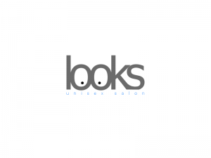
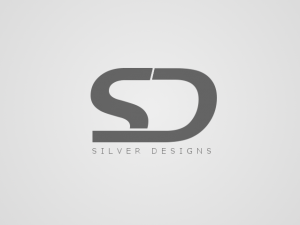
Thoughts on my latest works?
- Thread starter Warhammer
- Start date
- Status
- Not open for further replies.
unknown_user0032
I Love YTtalk
Hehe I like the first, looks good! the SD one reminds me of another logo, but it's escaping me which one...
SamaJaffa
Just some E[PIC]nglish guy
I like how the two o's in 'looks' are like eyes so that's pretty cool but other than that, the logos are simple and don't stand out that much for me. Don't get me wrong, they still work well but maybe you could add some more detail like you did with the two o's. For example, (this is just off the top of my head) the way the SD in Silver Designs are put together looks like a bit like a race track to me so maybe you can add a checkered white design maybe where the line splits the two letters. Nevertheless, great logos! 

Warhammer
Posting Mad!
I like how the two o's in 'looks' are like eyes so that's pretty cool but other than that, the logos are simple and don't stand out that much for me. Don't get me wrong, they still work well but maybe you could add some more detail like you did with the two o's. For example, (this is just off the top of my head) the way the SD in Silver Designs are put together looks like a bit like a race track to me so maybe you can add a checkered white design maybe where the line splits the two letters. Nevertheless, great logos!
Thanks for the suggestion, mate. I'll try to see if it works

unknown_user0032
I Love YTtalk
I like how the two o's in 'looks' are like eyes so that's pretty cool but other than that, the logos are simple and don't stand out that much for me. Don't get me wrong, they still work well but maybe you could add some more detail like you did with the two o's. For example, (this is just off the top of my head) the way the SD in Silver Designs are put together looks like a bit like a race track to me so maybe you can add a checkered white design maybe where the line splits the two letters. Nevertheless, great logos!
I think the problem is bright colours and wacky designs these days is seen as very amateur; corporate design is supposed to be very stark, very bold and very simple to avoid distraction. It's kinda 'fashionable' these days amongst some companies (especially things like offices: law firms, insurance firms, graphic designers, etc etc). Shame really, I quite like a bit of colour!
SamaJaffa
Just some E[PIC]nglish guy
Yeah I see what you mean. A lot of companies want to look more "professional" with a simple and 'less is more' look. It makes sense but it doesn't hurt to be a little creativeI think the problem is bright colours and wacky designs these days is seen as very amateur; corporate design is supposed to be very stark, very bold and very simple to avoid distraction. It's kinda 'fashionable' these days amongst some companies (especially things like offices: law firms, insurance firms, graphic designers, etc etc). Shame really, I quite like a bit of colour!

Warhammer
Posting Mad!
I think the problem is bright colours and wacky designs these days is seen as very amateur; corporate design is supposed to be very stark, very bold and very simple to avoid distraction. It's kinda 'fashionable' these days amongst some companies (especially things like offices: law firms, insurance firms, graphic designers, etc etc). Shame really, I quite like a bit of colour!
Yes.. you understand it very well

These logos are corporate style.. so that's why they are not so colorful.
unknown_user0032
I Love YTtalk
Yeah I see what you mean. A lot of companies want to look more "professional" with a simple and 'less is more' look. It makes sense but it doesn't hurt to be a little creative
I like it when a company has a nice simple design but then a REALLY bold splash of pattern or colour that makes it stand out

- Status
- Not open for further replies.


