Right you might hate me after this but graphical critique is what im good at.
1. What an awesome concept! Absolutely love the idea and you have pulled it off pretty well!
2. There are some things you could improve to make it even better.
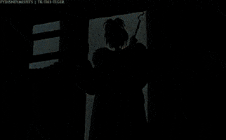
3. The font you are using is extremely spaced apart and appears to be stretched vertically as well, I would reduce both of these and return the stretch to 100%
4. The font is sitting on top of the top box while its overlapping the second one, might need to play with a bit of placement.
5. Are the previews for the other videos actually video or an image?
5a. If they are just images, I would recommend replacing the pictures with Bright green and then use after effects to color key it to use your previous videos.
6. It looks very empty on the right, you could possibly writing "Thanks for Watching" "Like, Comment and Subscribe" & "When your next upload schedule will be.
7. Possibly redo her cigarette and smoke, as it looks a bit odd now.
7a. I liked your suggestion of adding animated smoke to it, you can easily find those effects online and add them with after effects, you could even add a faint glow to represent it burning.
Right don't be disheartened, your intro is already 50x better than most and is actually interesting! I'm just giving some tips because it doesn't matter if the person doesn't want to hear it, opinions from other people are always useful!
Keep up the great work, would love to see an updated version if you do use any of the tips
")