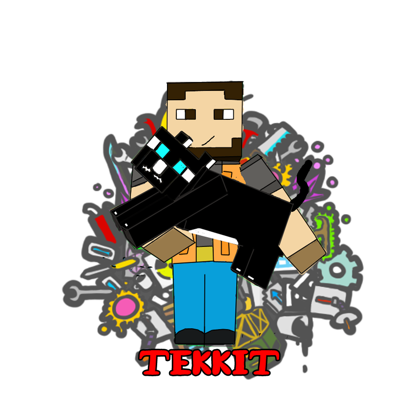
Pretty nice. There's a lot to work with here. Honestly, the biggest problem in my mind is that there's just too much going on, and you need to decide what to take out.
The most interesting part of the logo is the background, as I assume it's completely your own work, and so essentially the truest indicator of your talent and appeal. While the Minecraft figures may be unique within the context of the game (I don't play Minecraft. Are they?), I don't think they do much to establishing your own personality. While the character and his pet may be "you", in a weird way they're the least "you" thing about the logo.
Your name should almost certainly be more prominent. Perhaps just a larger font where it is, or perhaps it should be the centerpiece of your logo. I would also consider just using the head or a "bust" (shoulders up) of your character in your logo. It gets the point across that it's Minecraft with less clutter. While the hand-drawing is neat, I'd recommend photoshopping a screencap of your character in its place.
Just my 2 cents. Hope it helps![DOUBLEPOST=1381131816,1381131667][/DOUBLEPOST]Just wanted to drop a few adjectives that come to mind when I see your logo: fun, friendly, inviting, colorful, energetic. Most of that comes from the background, though the animal does help.
")