Avatar Review?

CommMatt

Posting Mad!
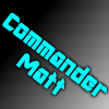
Hi! After quite some time I've finally gotten around to messing around in paint.net and made a Avatar for my channel.

The attached image is V4.5 of the avatar, and I'd love feedback.

I'm thinking of cropping out the empty spaces, but I don't know if I should or not... Open to suggestions on what to put in the empty spaces, if anything at all.

I feel like it's seriously missing something, and I could really use pointers/help.
The picture is attached.


Thank you everyone!

Edit4: Remade to a V4.5. Open to further suggestions.
 

Attachments

  • CommMattV4.5.png
    CommMattV4.5.png
    590.7 KB · Views: 0
Last edited:
Like said, simply too much irrelevant stuff there. Also the choice of colors looks very bland. And finally, I think when it's squeezed down to 98x98 pixels it's simply impossible to make anything out of it.
 
If this if for your youtube picture and not banner, i myself wouldnt put tutorials, playthroughs, gaming on it. Id simply just have a logo or initials and not make it to cramped.
As for the size.. https://support.google.com/youtube/answer/2976309?hl=en-GB There you go :)
Thank you! Yeah, I overshot and made it quite large, so I was like "How am I gonna fill all this space??"

Like said, simply too much irrelevant stuff there. Also the choice of colors looks very bland. And finally, I think when it's squeezed down to 98x98 pixels it's simply impossible to make anything out of it.
What other colors could I use? I'd like to keep it a cool-color. Y'know, blue, black, grey, green.
As for the squeezing... Yeah... As said I overshot.
 
What other colors could I use? I'd like to keep it a cool-color. Y'know, blue, black, grey, green.
As for the squeezing... Yeah... As said I overshot.

I'm not a graphic designer myself, but your avatar on YTTalk looks already better colorwise.

The size itself is not that much of an issue as it can be downsized (automatically by YT) easily due to having same dimensions, but what I mean is adding too much stuff into very small space won't work well.
As someone said in a channel review I asked for, my avatar and banner point out I'm a gamer; but just that. I'm trying to step away from the whole "I'm a Gamer!" thing. The colors... So, shiny (light) blue, on grey, which then goes into black?

I appreciate your replies. :)
 
The colors... So, shiny (light) blue, on grey, which then goes into black?

Doesn't (shouldn't?) necessarily be that color combination, but I mean the overall feel of it. If you just smash bland red text on black background and won't even bother adding any borders to it, it does become a stress for the eyes.
 
Doesn't (shouldn't?) necessarily be that color combination, but I mean the overall feel of it. If you just smash bland red text on black background and won't even bother adding any borders to it, it does become a stress for the eyes.
Indeed... Alright, thanks![DOUBLEPOST=1412705862,1412695872][/DOUBLEPOST]
If this if for your youtube picture and not banner, i myself wouldnt put tutorials, playthroughs, gaming on it. Id simply just have a logo or initials and not make it to cramped.
As for the size.. https://support.google.com/youtube/answer/2976309?hl=en-GB There you go :)
Doesn't (shouldn't?) necessarily be that color combination, but I mean the overall feel of it. If you just smash bland red text on black background and won't even bother adding any borders to it, it does become a stress for the eyes.
Recreated it. Darkened the words, removed the extra bits, added glow effect.
Thinking of cropping it down some, unless I can somehow fill the empty space above and below (any suggestions?)
[Look to original post for new picture]
Thanks!
 
Maybe I just have a bad eyesight but I cannot make anything out of it. Totally unredable.
Yeah - I'm working on a grey layer behind the words, but above the background.
The one time having a long name as a username (Commander) bites me in the butt...

Edit: Made something new, finally semi-satisfied... I hate being a perfectionist. [Re-Attached to OP]
 
Last edited:
Back
Top