unknown_user908435903
I Love YTtalk
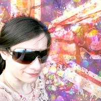
1) >>>> 
Duller version) >>>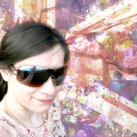
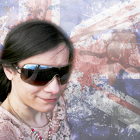
2) >>>>
Number "1" is the 1st icon I created, as you can see I made the background very colourful by adding colourful bokeh on top of the Union Jack which I added in to the background. Wasn't sure if that bokeh distorted the Union Jack too much! I also used the "curves" so I could make the icon look not so dark and dull.
Then number "2" is just with the Union Jack, I used the "curves" so I can make this icon a bit lighter, as I tried it out on YouTube without the "curves; the icon was too dark! So I added the curves. I used a different bokeh overlay. This time it was a silvery tone and was able to reduce the "opacity" so it would show the Union Jack.
So which Icon do you like???

Duller version) >>>

2) >>>>

Number "1" is the 1st icon I created, as you can see I made the background very colourful by adding colourful bokeh on top of the Union Jack which I added in to the background. Wasn't sure if that bokeh distorted the Union Jack too much! I also used the "curves" so I could make the icon look not so dark and dull.
Then number "2" is just with the Union Jack, I used the "curves" so I can make this icon a bit lighter, as I tried it out on YouTube without the "curves; the icon was too dark! So I added the curves. I used a different bokeh overlay. This time it was a silvery tone and was able to reduce the "opacity" so it would show the Union Jack.
So which Icon do you like???


