You are using an out of date browser. It may not display this or other websites correctly.
You should upgrade or use an alternative browser.
You should upgrade or use an alternative browser.
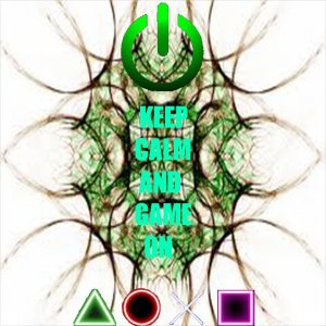
what do you think of this picture?
- Thread starter zypher634
- Start date
unknown_user0032
I Love YTtalk
The text needs a black outline. Can barely read it on its own. And Impact is not the most awesome font (it's effective and bold, but everyone uses it). Hope that helps? ")
Bryant
I Love YTtalk
I really like it. it's unique :]i made this by myself. im an ok gfx artist. im not the best but i made this myself and want feedback on it
kkushalbeatzz
The original, diabolical, kkushalbeatzz
The background image is far too blurry. Also, I agree with Frankie about the black outline on the text. Fix that, and it'll be really good.
unknown_user908435903
I Love YTtalk
The text needs to be a different colour. At the moment it blends in too well; Which makes it slightly harder to read. Maybe change it to black or another contrasting colour.
unknown_user908435903
I Love YTtalk
i think what im gonna do is give it a black outline that way its easier to read. i just couldn't find a font that i liked which is why i went with impact
Yeah a black outline is good too.
