You are using an out of date browser. It may not display this or other websites correctly.
You should upgrade or use an alternative browser.
You should upgrade or use an alternative browser.
Rate My Thumbnail Design
- Thread starter TheHolyMedic
- Start date
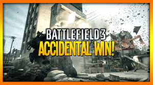
TheHolyMedic
I Like T.
Looks good. Straight to the point and the colours make it stand out.
Thanks bro!
 [DOUBLEPOST=1367169230,1367169205][/DOUBLEPOST]
I really like it, bro! Both design and colors are very interesting! Very good job!
Cheers man!
")
ForeverAlonePrick
I don't know what's going on.
I think it's fine. The bottom text looks more 2-dimmensional while the one above it doesn't, which looks a bit odd. I suppose it's fine though, it gets the point across.
TheHolyMedic
I Like T.
I think it's fine. The bottom text looks more 2-dimmensional while the one above it doesn't, which looks a bit odd. I suppose it's fine though, it gets the point across.
Probably because it's the original Battlefield text. It would look a bit odd if it was 3D.
TheHolyMedic
I Like T.
I love it :3 10/10
Knew you would! Thanks man! ;D