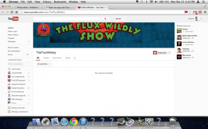
Did you use the template? The banner is no where near lined up. The avatar/logo is okay. Reminds me to much of Looney Tunes. It's not very original in my opinion.
Yeah I would have to agree with them as well. Try to be a little more creative. Even though YouTube and Google have practically taken that away with the new layout, but you can still put more originality into it.
Haha, I have the original ToonStruck game. Amazing game, and Flux was a great character. As for the banner, you need to readjust the position to accommodate the "lowest common denominator" of screen resolutions.
This site uses cookies to help personalise content, tailor your experience and to keep you logged in if you register.
By continuing to use this site, you are consenting to our use of cookies.
")