Rate my comedy intro?

Rip the Script

Mr. Sarcasm
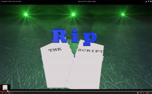
So, last month, before I launched my sketch comedy channel, I designed a quick intro in 3ds Max and After Effects, and composed a theme to go with it. I was pretty satisfied with how it came out, but I want to take my channel to the next level, and was wondering if there is anything I need to do to it, or if I just need a new one. Please rate it, and post any suggestions or comments about the intro.

The intro is from the start of the video, until about eight second in.
 
It's good. I really like the animation!
I had to watch it twice to really get it though, for three reasons:
  1. At the final screen 'The Script" is much smaller than the word "Rip".
  2. There's a lot of space between the words so "Rip" and "The Script" doesn't necessarily read like one phrase. It shouldn't be confusing for people who already know the name of your channel, but if the video was embedded somewhere and your username wasn't close by, it might not make sense the first time they see it, and that means they won't remember it.
  3. I only saw/heard the sheet of paper being ripped once, so when I saw the much smaller ripped out words it actually took a second to remember where they had come from. If the end screen showed the word "Rip" right above the two half sheets of paper it would have been clearer.
I'm sure you can do this better than I can , but I've attached a 'sample' version of what I'm trying to say - the words are closer together and the half pages are still in tact.
sample.jpg

I think you're really close to a memorable intro screen. Best of luck!
 
I agree with everything Bri said, however I would add that you should perhaps make Rip more uniformed, perhaps all in capitals would look nice like RIP and should draw in more attention.
 
It's good. I really like the animation!
I had to watch it twice to really get it though, for three reasons:
  1. At the final screen 'The Script" is much smaller than the word "Rip".
  2. There's a lot of space between the words so "Rip" and "The Script" doesn't necessarily read like one phrase. It shouldn't be confusing for people who already know the name of your channel, but if the video was embedded somewhere and your username wasn't close by, it might not make sense the first time they see it, and that means they won't remember it.
  3. I only saw/heard the sheet of paper being ripped once, so when I saw the much smaller ripped out words it actually took a second to remember where they had come from. If the end screen showed the word "Rip" right above the two half sheets of paper it would have been clearer.
I'm sure you can do this better than I can , but I've attached a 'sample' version of what I'm trying to say - the words are closer together and the half pages are still in tact.
View attachment 5847

I think you're really close to a memorable intro screen. Best of luck!
I agree with everything Bri said, however I would add that you should perhaps make Rip more uniformed, perhaps all in capitals would look nice like RIP and should draw in more attention.
Sorry it took me so long to respond (a month, actually)! Thank you both for your suggestions! I think I'll make a few of the suggested tweaks to the intro when I have some time. :)
 
Back
Top