You are using an out of date browser. It may not display this or other websites correctly.
You should upgrade or use an alternative browser.
You should upgrade or use an alternative browser.
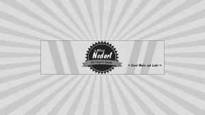
Rate my Branding for the new layout.
- Thread starter unknown_userr433436365
- Start date
Bryant
I Love YTtalk
looks like my thumbnails and avatar, so I obviously like it haha.
SanctumGamingNetwork
Loving YTtalk
Love it, what is the background for tho?
Unknown_User12
Account Closed
Well, I would expand the middle section. Not include more, just have that pattern be wider so on PCs there aren't 2 styles. As the PC one goes all the way across that image. But I like it. Looks professional, not too over the top
Chef Kendra
Chef and Video Creator
Yeah, it looks like Bryant's and like Bryant's sooo.... like it a lot. 

Bryant
I Love YTtalk
aww thanks Kendra!Yeah, it looks like Bryant's and like Bryant's sooo.... like it a lot.

Unknown_User11
Account Closed Upon Request
AMAZING.
jake weber
Check out my Partnered Channel!
Very retro looking! I like it! 

