You are using an out of date browser. It may not display this or other websites correctly.
You should upgrade or use an alternative browser.
You should upgrade or use an alternative browser.
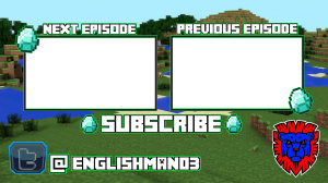
**NEED** some of your opinions on my MineCraft Outro template.
- Thread starter EnglishMan03
- Start date
DemolitionPandaTV
A Destructive Panda
looks really good, what did you use to make it? I'm thinking of using one of those when i get a few more vids.
Kate (Caitlin)
I make videos on the internet...I guess?
Looks good, however like @Lady Chou-Chou said the twitter thing doesn't work very well with it overall.
QwertyCake10
Liking YTtalk
Yeah, as what the other people said make the twitter icon a lighter blue and possibly think about make the 't' white. I LOVE the outro though and I'm looking to learn how to make my own.
XtremeN00Bz
Posting Mad!
Very good man  however the twitter logos a weird colour maybe fix that
 however the twitter logos a weird colour maybe fix that