Hello, I’ve recently started to make my own motivational videos. I always wanted to do this but since I just started on YouTube, I’m kind of disappointed because it’s harder than I thought. Anyone who wants to check out my channel, you can look for “ GrowthForAll” and let me know what you think about my first video (title, thumbnail, and the quality.) Any tips/support will be appreciated. Thank you
You are using an out of date browser. It may not display this or other websites correctly.
You should upgrade or use an alternative browser.
You should upgrade or use an alternative browser.
I need some tips please
- Thread starter Layoo
- Start date
First of all, you are allowed to post links on this board. The ban on links on other boards on this site is done to prevent spamming, but in this board, providing direct links to your channel is a necessary evil sometimes.
That said ... there were actually several youtube channels called Gorth For All. Which of these is yours?

 www.youtube.com

 www.youtube.com
 www.youtube.com


 www.youtube.com
Can you also provide us with a direct link to the video you want us to critique?
That said ... there were actually several youtube channels called Gorth For All. Which of these is yours?
LLMV
This channel is basically about motivation, personal growth, and other life-related topics.
www.youtube.com
GFA Motivation
My channel has one simple goal, to motivate you, to give you that little push you need to go after your dreams. Here you will find motivational videos that f...
www.youtube.com
Growth For All
www.youtube.com
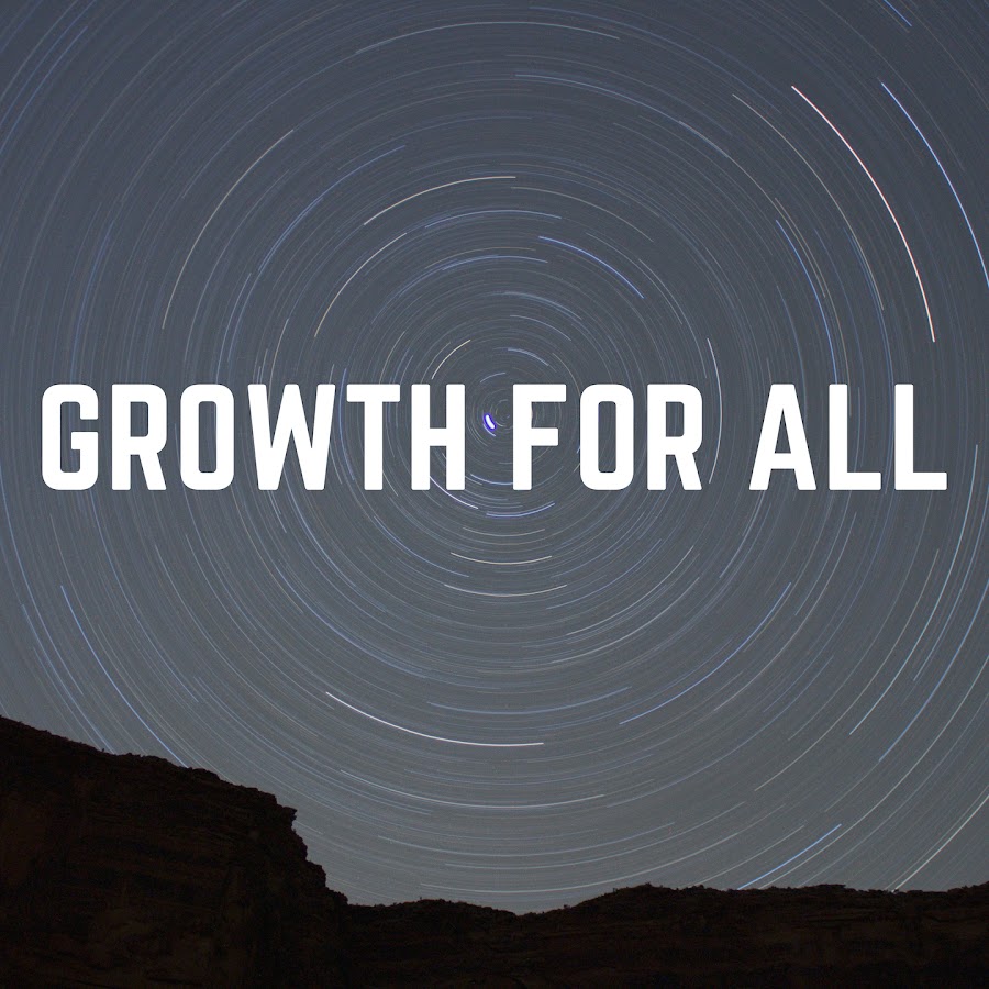
Growth For All
GROWTH FOR ALL is a official youtube channel for life changing speech & motivational videos. To get all videos alert , subscribe to our YOUTUBE channel:https...
www.youtube.com
Can you also provide us with a direct link to the video you want us to critique?
Ok, your first order of business should be to get a name for your channel that isn't already taken.
That said, I haven't seen your video yet, but I can critique your thumbnail and title.
Your thumbnail seems kind of bland. The idea of a zig-zag seperating the left and right sides of the thumbnail sounds cool in concept, but it's execution is lacking. Stay inside the lines. Keep it nice and slick. The zig-zag needs to be a clear dividing line; the black needs to be entirely on the left and the green needs to be entirely on the right.
What are those blue lines on the left side? Are they supposed to be a dragon, or are they supposed to be another font of text? If it's the latter, then I can't read it.
Try to include a face shot in your thumbnails. Perhaps a stock photo of someone smiling and jumping for joy, as that would be consistent with the theme of your videos. Try and include that on the right side while your text is on the left side of the thumbnail.
Text in a thumbnail is not an automatic no-no, but it's recommended you keep it to a minimum. The title and first few words of your description already provide text for the viewer.
You also want to use heavily contrasting colors as well as colors that go well together aesthetically. Don't let that latter requirement scare you; it's actually a lot easier than you probably think to check if a pair of colors go well together. In fact, professional artists have known the secret formula since the Renessaince Era!
Taw-daw! I present to you ... the color wheel!
Basically, colors that are opposite of each other on the color wheel will usually look good together. So red goes well with green (like Christmas), blue goes well with orange, and so on and so forth.
"Opposite" does not necessarily mean 180 degrees, but you should aim for at least 90 degrees apart from each other on the color wheel, recommended 120 degrees.
Another really easy way to know what colors look good together is to check out the sports uniforms for most professional sports teams. Those teams, and the multi-million dollar marketing firms they can afford to hire, have already done all the research for you. Case in point: The basketball team The Los Angeles Lakers wears yellow and purple in their uniforms. As you can see above, yellow and purple are opposite each other on the color wheel!
In addition to using good looking colors, your colors also need to be high contrast. That's also a lot easier than it sounds. In a nutshell, colors contrast if one is light and the other is dark. Take, for instance, the post you're reading right now: It's black text against a white background, and that contrasts really good! But doesn't have to be two different colors; it can be two different shades of the same color, as long as one is light and the other is dark! Take, for instance, this title screen of a famous video game:
https://i.ytimg.com/vi/zed9meG9fjo/maxresdefault.jpg
It's brown against brown, and yet you can still read it ... because it's dark brown text against a light brown background!
That blue stuff on the left side of your thumbnail is hard for me to read, because it's dark blue against a black (aka dark) background. You should make it higher contrast.
Now, as for your description, you should not include hashtags in your description. Write fully coherent sentences in the description. Youtube's version of the "hashtag" are called "tags" (no hash). You are allowed a maximum of 500 characters for your tags; they don't require the # sign in front of them (instead; there's a separate section in the video's metadata for tags that is separate from descriptions), and on top of all of that, using the space in your description to include more tags is actually against youtube's rules.
Instead of including hashtags, the description needs to ... well ... describe the video! Granted, the title already does 99% of the work in telling viewers what to expect, but the description can help contribute to that as well.
So that about does it for the thumbnail and description. I'll check out the video itself and then get back to you.
Ok, I just checked out the video ... well, some of it. I saw enough to be able to tell what the rest of the video was about.
Here are some suggestions:
1. Add more production value. Instead of this just being a matter of written tips appearing on screen for a brief time against a single still image, try and add some motion. Videos are meant to be motion-based. Each second of your video has 30 frames in it. Use them. Why should we watch the video instead of just reading a written article on the same topic? How about a little voice acting? Maybe some footage (that is ... full motion footage) of people acting according to the advice you're giving?
2. Do you have any credentials that would cause people to actually trust your word? If you're just some random jackass who's handing down life advice despite not having even the slightest grounds to know what you're taking about, then why the f**k should anyone care?
If you don't have any credentials of your own, maybe you should research these matters and consult sources (such as books published by doctors) that are relevant to the videos you're making, and then include bibliographies in your video descriptions.
3. Niche down. Instead of just giving this generic advice about how to "succeed in life," instead give tips on how to grow as a person in very specific areas. For example, tips on how to conduct the perfect job interview. Tips on how to ask a girl out on a date. Tips on how to groom yourself and dress for success. This is something that all aspiring youtubers need to know: Niche down! Gone are the days when you can just be a variety channel. Until you get about a million subscribers, you won't grow unless you choose a niche and stick with it.
For example, take your five tips in this video, and turn them into five different videos.
5 Ways to Avoid Negative Thinking and Stay Positive
5 Ways to Take Initiative on Your Goals
5 Tips to Stay Focused and Committed on Your Goals
5 Ideas for Stepping Out of your Comfort Zone
5 Exercises for Maintaining Your Self-Confidence
Give those suggestions a whirl, and then get back to me!
Last edited: