You are using an out of date browser. It may not display this or other websites correctly.
You should upgrade or use an alternative browser.
You should upgrade or use an alternative browser.
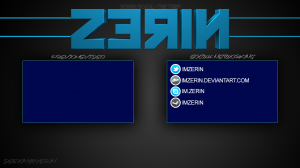
How is my new video outro?
- Thread starter imZerin
- Start date
KdawgCreations
KC Punk! KC Punk!
looks slick and very nice the words "previous" and "social networking" are hard to read not the end of the world but just a heads up but other than that looks pretty nice
imZerin
Liking YTtalk
I like it, but the font for previous video and social networking doesn't appeal to me personally. I don't like how there is almost no distinguishable space between Previous and Video.
All in all, I like it
do you think i should add more spaces in between the words??
should i put more spaces between the words??looks slick and very nice the words "previous" and "social networking" are hard to read not the end of the world but just a heads up but other than that looks pretty nice
KdawgCreations
KC Punk! KC Punk!
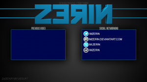
Change the font completely letters are too close together and the italicized look an't helping either
imZerin
Liking YTtalk
Change the font completely letters are too close together and the italicized look an't helping either
ok i will edit it and upload a picture[DOUBLEPOST=1371314881,1371314652][/DOUBLEPOST]
Change the font completely letters are too close together and the italicized look an't helping either
simple easy to read bebas neue
Attachments
KdawgCreations
KC Punk! KC Punk!
that
works simple and clear to readok i will edit it and upload a picture[DOUBLEPOST=1371314881,1371314652][/DOUBLEPOST]
simple easy to read bebas neue
imZerin
Liking YTtalk
I think there's too much time between the beginning and when the actual image flashes onto the screen xP
the start is where the music will play while im saying thanks for watching blah blah blah and the end is will idk what