Nosensefornonsense
Active Member
Hello,
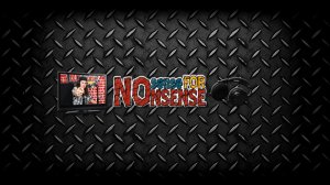
I've created this channel banner which I use not only for my youtube channel but also for tumblr and google +
As you can see the banner has a steel plating as a backround. I believe it makes the surrounding look beast. Originally the logo "Nosensefornonsense" was textured but I believe the texture blends nicely with the steel. I used shadows on the TV, logo and earphones but I also used bevel emboss on the earphones which I as a bit hesitant about doing but it seems ok (if you agree).
I'm ok at photoshop but I don't have a keen/sharp eye for this so if possible can some take a quick look at this image and tell me the small and important things that can be improved? (Note the image has already been uploaded as a banner since I can't leave that space empty ^^)
Thank you for your help
Nosensefornonsense

 good job !