You are using an out of date browser. It may not display this or other websites correctly.
You should upgrade or use an alternative browser.
You should upgrade or use an alternative browser.
Avatar Review
- Thread starter Apoxa
- Start date
SamaJaffa
Just some E[PIC]nglish guy
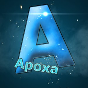
That strobe light thing at the top doesn't really look good there. It looks very random and weird. I think it would look better under your username. Also, for the background, you should use two colours. Blue and black would suit best. If you're using photoshop, use the gradient tool. These are just my opinions so you don't HAVE to follow what I say XD overall, nice avatar ")
Apoxa
I Love YTtalk
That strobe light thing at the top doesn't really look good there. It looks very random and weird. I think it would look better under your username. Also, for the background, you should use two colours. Blue and black would suit best. If you're using photoshop, use the gradient tool. These are just my opinions so you don't HAVE to follow what I say XD overall, nice avatar
Thank you for the feedback!
I'll change those things as soon as I can and see what they look like.
M424Filmcast
Director, Producer, Short Filmmaker, Musician
Yeah, the flare is kind of weird right there. On the top left of the "A" would be good as that is where the "shiniest" part of the letter is. If you like the colour scheme you already have, I would add more light and dimension to the "Apoxa" as well to help it stand out. Make sure you use the same light angle that you used on the "A" so it will look consistent.
Otherwise, I think it looks pretty good.
Anyway, my two cents. Hope it helps.
Otherwise, I think it looks pretty good.
Anyway, my two cents. Hope it helps.
dylanmanincfanatic
If My Thought Dreams Could Be Seen...
Nice and simple, love it.Started a new channel and decided to make my own avatar. It's my profile picture right now but I'll also attach it.
Apoxa
I Love YTtalk
dylanmanincfanatic
If My Thought Dreams Could Be Seen...
You're very welcome. Keep up all the hard work and creativity. =)Thanks
Unknown_User12
Account Closed
I'm going to be kinda frank with you. The design looks rather bland. So many logos look like this, it's nothing special. If you are a designer, I recommend you learn how to use the line tool in illustrator to create your own letters. My logo is a combination of A, P and G to fit my channel name. I'd recommend you take a few letters from your name and do something similar. I'd go ahead and take away the name, if someone sees the avatar, the name is next to it. The flare is not needed, nor is it placed properly. If you use a flare, it should be on an edge, not in the middle of a shape.
Apoxa
I Love YTtalk
I'm going to be kinda frank with you. The design looks rather bland. So many logos look like this, it's nothing special. If you are a designer, I recommend you learn how to use the line tool in illustrator to create your own letters. My logo is a combination of A, P and G to fit my channel name. I'd recommend you take a few letters from your name and do something similar. I'd go ahead and take away the name, if someone sees the avatar, the name is next to it. The flare is not needed, nor is it placed properly. If you use a flare, it should be on an edge, not in the middle of a shape.
Thank you. I appreciate the honest feedback. I wasn't quite sure as this was my second attempt at making an avatar.