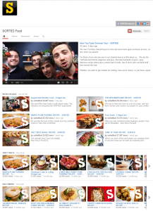
First look at the new youtube channel design

Wreckless Eating

YouTube Space LA Alumni
I cannot say I am very keen on the extent of the integration right now, I love the branding stuff, that looks awesome. I think it could help with people viewing their subscriptions more often which is good. I wonder if they're having proper backgrounds behind them in some way in addition to the branding at the top. I hope image maps are still available for the branding too.
 
I was literaly JUST about to make a post about this after I saw IJustine's background. Needless to say. It looks like crap.
 
I'm agreeing with most of the comments on that blog: the new changes are HORRIBLE.
What they've presented in those links is horrible. I know it's not "complete" yet, but if they advertise those channels, then they should expect some feedback.
They are taking away so many customization options. I'm not a fan.
The trailer idea sounds interesting, though.
 
Keep in mind that the above layout will pop up when a subscriber hits on your channel from the front page, so instead of the generic BS feed that shows them what you liked/commented thrown in with your videos, they see this layout-which means they are exposed to more of your videos. I really don't see how that will be a bad thing.
 
Keep in mind that the above layout will pop up when a subscriber hits on your channel from the front page, so instead of the generic BS feed that shows them what you liked/commented thrown in with your videos, they see this layout-which means they are exposed to more of your videos. I really don't see how that will be a bad thing.
how are they exposed to more of your videos? :/

If you're talking about having your videos shown in the grid, You can choose to direct people to your Uploads tab with the current layout if you wanted. Is that what you mean?

just confused on the "more" part.
 
how are they exposed to more of your videos? :/

If you're talking about having your videos shown in the grid, You can choose to direct people to your Uploads tab with the current layout if you wanted. Is that what you mean?

just confused on the "more" part.

If someone is subscribed to our channel, when they go their frontpage and click on us on the left side, they get our feed, which is littered with uploaded videos and whatever videos we liked/commented on. There are fewer videos displayed there (take into consideration how far people will scroll down) than on the new layout.
 
This is terrible, i'm heartbroken.

PS: Thanks for sharing Wreckless!

But in the end, it's google.. and youtube.. I have full faith in whatever changes they make, they have a proven track record of good change.

EDIT: I honestly think you could get more subs this way, I wouldn't be surprised..
 
Back
Top