- Joined
- Sep 24, 2017
- Messages
- 199
- Reaction score
- 65
- Age
- 38
- Channel Type
- Youtuber
Lol! Thanks!It looks okay, nothing too flashy, but as you said, a simple banner works just as well")
Lol! Thanks!It looks okay, nothing too flashy, but as you said, a simple banner works just as well
Also if you want to try out other more bold fonts (as curly fonts can be harder to read on small screens), try dafont.com Hey Veronica!
I had a look at your banner, obviously take my opinion with a pinch of salt as I'm an enthusiast like yourself
I felt that the purple is a bit dark for me personally. Maybe a pattern or something could be a bit more engaging? Also it looks as though the photos are cut off at the bottom for me, but I'm not sure if that's intentional?
Other than that it is nice

 Thank you!
 I will keep your suggestions in mind when I'm ready to update my banner. It just took sooooo long
  especially trying to get the images the right sizes. I'm getting so busy right now. I was away from the forum for about a week. I had tons of notifications. I'm playing catch up now.
")
Thanks for the feedback! I will definitely do that. I plan on changing it up a bit to include some of the changes everyone has suggested.Hi veronica. I like the Banner. i think you should just a little text like "new videos every thursdays" or so on. and some text that tells us audiences what contents you are creating.
 I've mocked up a version (Because I had a bit of time free and as I say it's easier to show what I mean than tell...apologies I couldnt get your exact font) it's very rough but I knocked it together in 5 minutes (if I had half an hour I could probably refine it to make it look smoother but as I say this is just to give a rough idea of what im talking about:
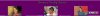
 I took in account most of the suggestions you guys gave me. To me, it's a lot better than before. Not as plain. Although, I'm a bit of a plain person anyway.
  Forgive me for the small text to the left of the banner. It was the only way to ensure nothing was cut off across the broad. A bigger font always seemed to cut off the text in mobile view.
  I don't know how you all are able to incorporate so much text on your banners. I seem to only have a limited space to work with before things start getting caught off. I really wanted this text to be bigger because it contains information about my channel. If you guys know how I can do this without cutting off the text in mobile view please let me know. Should I care about mobile view?
  I don't know. These days people used their phones more than laptops and computers.
 Hopefully, you guys think my banner looks better now that I've made a few changes.
 Love the new banner, especially with the social media icons. One recommendation is that the 'New Monologues Every Week' text is rather small and not visible on my phone or tablet at all.Guys! Guys!
I've updated my banner today!
Sorry @TYTD and @Nameless I'm just now seeing your responses.
Love the new banner, especially with the social media icons. One recommendation is that the 'New Monologues Every Week' text is rather small and not visible on my phone or tablet at all.
 It's not visible on mines either. When I make the front bigger, the text gets cut off. I don't know what to do. I want to enlarge the text because it's looks better with a bigger font. However, when I enlarge the text even a little, it becomes cut off on the mobile view.
