- Joined
- Aug 27, 2017
- Messages
- 12
- Reaction score
- 8
- Age
- 43
- Channel Type
- Youtuber
 Greetings All,
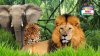
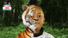
I recently had my channel review by a professional and he suggested I play around with my Thumbnails to see if it will yield higher results. My channel is primary a learning channel for kids so I want to try out different ideas that will gain their attention. After all my audience are less likely to know how to read and will be more interested in what the photo looks like.
Below is a current A/B testing I'm performing and would like to get your opinion on which picture you would likely click on to view.

")
")
 I really like the lion it is well positioned, relaxed, friendly. The angry tiger and the stretched elephant are too much (I believe), maybe you can replace them both with only your logo.