PleaseReview| Channel Changes

Voice of Vanessa

Dimple-Smiles <3
Joined
Mar 16, 2012
Messages
811
Reaction score
671
Age
30
Location
Brooklyn
Channel Type
Vlogger
Hey you guys! <3 I made some changes to my channel today. I changed my background and I wanted to ask what you guys think of it. I also have changed my logo to something I think is more fitting for me.

http://www.youtube.com/voiceofvanessa <----- go there to check out my background

My logo was what you see below. I don't really like it that much anymore and it seemed so plain so I decided to draw my own logo to something that is more "me".
Voice of Vanessa LogoGirl.png

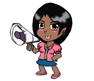
Here is what my new Logo is going to be now (below). I thought this would be more fitting because it's more detailed and it looks like an animated me holding a megaphone. I love to draw and I love anime so this makes me feel more comfortable and happy. She's wearing the outfit I wear in my intro video. I thought it would be a good idea to dress her up like me :p
VoiceofVaness Girl.png
I am also introducing another animated drawing of me that is on my page as well..and might be in my videos as a logo too. I'm still thinking about it... this cartoon of me is wearing the shirt I wore in my video "Creepy Pedo Man". <3
vovgirlcute.png
Please review these changes to my channel and tell me what you think! <3 Thanks so much for reading!
 
  • Like
Reactions: NTWGRay and Vicboss

Michael

I Love YTtalk
Joined
Aug 31, 2011
Messages
22,357
Reaction score
16,030
Channel Type
Youtuber
I think your new logo is much better, the old one being like a silhouette sort of thing I think would suit like a business or organisation, the new ones more fun and creative in my opinion. I like what you have done with the header, its far more pleasant to look at. I like all the changes and I think the linking to the playlists is what loads of others should do too, its a good idea to make things accessible like that, it could be good if you made them look like buttons they can click or perhaps underline them so people associate them as being links. You could use those logos as part of your watermark if you ever want to revamp it a little too. It's all very fitting and done well. The only small thing I can say is that I would either make it a little larger in width or, use a harsher black gradient just done over a little where your side gradients are, just a tiny bit on top would get the sides to blend perfectly into the solid black background colour. Nice work :up:
 
  • Like
Reactions: Vicboss

Voice of Vanessa

Dimple-Smiles <3
Joined
Mar 16, 2012
Messages
811
Reaction score
671
Age
30
Location
Brooklyn
Channel Type
Vlogger
Wow Michael! Great tips! I'm gonna work on the harsher gradient now...I tried to underline the playlist links but it looked sorrta horrible..so i'm gonna figure out a way to make it noticeable that they are actual links you can click. Thanks so much for the feed back really helpful! I'll keep ya updated to see if I fixed it well ;D
 
  • Like
Reactions: Michael

Michael

I Love YTtalk
Joined
Aug 31, 2011
Messages
22,357
Reaction score
16,030
Channel Type
Youtuber
Wow Michael! Great tips! I'm gonna work on the harsher gradient now...I tried to underline the playlist links but it looked sorrta horrible..so i'm gonna figure out a way to make it noticeable that they are actual links you can click. Thanks so much for the feed back really helpful! I'll keep ya updated to see if I fixed it well ;D
You wont need to make the lighter part harsh just so you know, just the very edge :) The underlining thing I cant say is 100% necessary but its considered good practice in web design, I know I sound like a hypocrite with our links on here not being underlined but they are grey rather than the black we have for text, even colour change can make them stand out as a link but I cant see many colours working on the blue.
 
  • Like
Reactions: Voice of Vanessa

Voice of Vanessa

Dimple-Smiles <3
Joined
Mar 16, 2012
Messages
811
Reaction score
671
Age
30
Location
Brooklyn
Channel Type
Vlogger
I have nothing more to add other than I love it I think it's so cute! It really fits you and your channel :D
Stef! Thank you! <3 I was scared that it might be as great as I wanted it to be..but it turned out alright~ :3
--- merged: Jun 23, 2012 at 1:47 AM ---
You wont need to make the lighter part harsh just so you know, just the very edge :) The underlining thing I cant say is 100% necessary but its considered good practice in web design, I know I sound like a hypocrite with our links on here not being underlined but they are grey rather than the black we have for text, even colour change can make them stand out as a link but I cant see many colours working on the blue.

Tell me what ya think now...I put bubbles next to each playlist so maybe that will give it more of that.."hey click me" feel...xD and I tried to get the harsh lines out ;3 tell me what'cha think!
 
  • Like
Reactions: Michael

Michael

I Love YTtalk
Joined
Aug 31, 2011
Messages
22,357
Reaction score
16,030
Channel Type
Youtuber
The sides seem fine now, I aint sure if the middles are slightly off it could be my eyes at this time of night. I like the bubbles, they go well with it all but I think if you moved them all left so theres a small bit of spacing between the bubble and the text then its all great :D
 

Voice of Vanessa

Dimple-Smiles <3
Joined
Mar 16, 2012
Messages
811
Reaction score
671
Age
30
Location
Brooklyn
Channel Type
Vlogger
The sides seem fine now, I aint sure if the middles are slightly off it could be my eyes at this time of night. I like the bubbles, they go well with it all but I think if you moved them all left so theres a small bit of spacing between the bubble and the text then its all great :D
Lol yea the middle was off because i streched something wrong...I tried to put it back..lol..might still be a bit off...i moved the bubbles to the left..i couldn't move em too much because they would bump into the other words..xD Thanks for the help..I hope it's better now :)
 
  • Like
Reactions: Michael