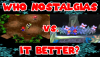
So here's the thumbnail I currently have planned for a video that I'm currently working on.
I believe this thumbnail not only accurately and succinctly conveys to the audience what this video is about, but also has a nice mish-mash of eye-catching colors (namely red, the most visible color to the human eye) without being an eyesore. It also uses font that is specific to the gaming franchise that the video is about. I also would like to think that the question that this thumbnail asks is a nice, catchy slogan that can be a trademarkable title for a new series of videos that adhere to this format!
What do you guys think? Any ideas for how I can make it more clickable?
Attachments
Last edited:
")