Could I have some guidance on my thumbnail?

Mithril

YTtalk Mad
Joined
Mar 17, 2014
Messages
354
Reaction score
106
Channel Type
Youtuber
Hi y'all! I felt like my thumbnail for my first video was cool at the time, but now I just feel like it looks unpolished and unprofessional compared to other videos.

episode 1 thumb.png

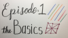
I've made a few alternate versions. I would love if I could get some feedback and some tips on what to improve. Thanks!

episode1 thumbnail.png episode1 thumbnail2.png episode1 thumbnailblue.png episode1 thumbnailolive.png episode1 thumbnailred.png
 
Joined
Feb 19, 2018
Messages
17
Reaction score
3
Age
36
Channel Type
Comedian
depend what is for the channel by thumbnail is look like kids education
 
Joined
Feb 19, 2018
Messages
17
Reaction score
3
Age
36
Channel Type
Comedian
My old ones or my new ones? Or both? Is that good or bad?
old one look like channel will be for kids under 10y - paint and draw and channel owner/creator is similar age
the new one its looking like channel is for kids education owner/creator high age

tell us what about is the channel and what effect you looking to get with thumbnail ?
you like to be click bait or professional look or ...
 

Bright1G

Member
Joined
Mar 28, 2018
Messages
19
Reaction score
8
Age
26
This is art channel, is it so hard to check? Remove that scary girl and put your own hand and thats it. There is nothing you can do if its art tutorial.
 
Last edited:

bigattck

I've Got It
Joined
Nov 15, 2016
Messages
178
Reaction score
47
Age
30
Channel Type
Other
the thumbnail (both) are confusing, it says learning the basics but what kind of basics. You are making them not look at your thumbnail because the whole sentence is below it. I suggest adding the whole sentence with the thumbnail, that way they can read it instead of the link. Different colors usually are used to help separate them like if basic is blue, novice is green, advance red, etc. Lastly, add different pictures, that way people think it is creative and easy to find.
 

Mithril

YTtalk Mad
Joined
Mar 17, 2014
Messages
354
Reaction score
106
Channel Type
Youtuber
the thumbnail (both) are confusing, it says learning the basics but what kind of basics. You are making them not look at your thumbnail because the whole sentence is below it. I suggest adding the whole sentence with the thumbnail, that way they can read it instead of the link. Different colors usually are used to help separate them like if basic is blue, novice is green, advance red, etc. Lastly, add different pictures, that way people think it is creative and easy to find.
They’re different versions of the thumbnail for the first video so they won’t all look the same like this. Are you saying to place the text closer to the middle of the thumbnail vertically? Thanks for your feedback!
 

bigattck

I've Got It
Joined
Nov 15, 2016
Messages
178
Reaction score
47
Age
30
Channel Type
Other
They’re different versions of the thumbnail for the first video so they won’t all look the same like this. Are you saying to place the text closer to the middle of the thumbnail vertically? Thanks for your feedback!
No i mean instead of having "starting with basics" every time, you add the title that will also be the video title.
 

Mithril

YTtalk Mad
Joined
Mar 17, 2014
Messages
354
Reaction score
106
Channel Type
Youtuber
No i mean instead of having "starting with basics" every time, you add the title that will also be the video title.
Ah, that is the video name, not the series name.
 

Curiosity Ridge

I make Videos
Joined
Mar 28, 2018
Messages
66
Reaction score
21
Age
27
Location
Canada
Channel Type
Youtuber, Other
I agree, with removing the girl drawing, add a hand instead and make sure you have a bight pop of colour to catch the attention of potential viewers.