Are my thumbnails eye-catching enough

Oscar J Stones

I've Got It
Joined
Feb 5, 2016
Messages
108
Reaction score
26
Age
25
Location
England
Channel Type
Youtuber, Cartoonist, Animator, Other
I want to try to maximise the amount of people clicking on my videos as much as possible, so if anyone has any tios for improving my thumbnails that'd be really great.
The most recent one should be attached, but there are a bunch more on my channel.
 

Attachments

buzzcuts

I've Got It
Joined
Jul 2, 2017
Messages
117
Reaction score
51
Age
34
Channel Type
Ranter
I think you're on the right track with your latest thumbnail. I feel like less is more when it comes to thumbnails; a lot of your examples have small white text that gets lost in the background and isn't really required IMO. I think just the images you chose are generally good, and would likely get more clicks without any text.
 

SlugoGaming

Active Member
Joined
Apr 3, 2018
Messages
33
Reaction score
9
Age
34
Location
Austin
Channel Type
Other
I kind of agree with what was said above. If you want to keep the white text maybe put a border around it and increase the size. I checked out how it looked on your channel and I can't read it on the video. Keep in mind the timestamp is also cutting part of it off.
 

tizzer65

I've Got It
Joined
Mar 1, 2018
Messages
148
Reaction score
58
Age
34
Location
Liverpool
Channel Type
Gamer
I'd say change the colour, that was the advice given to me. White and Black sometimes don't stand out for example in your most recent video on DBZ the white text is covered by Shenlongs chin. The size does need increasing also. Besides these criticisms I think the layout and design is spot-on. Also digging the skin head style man.
 

Steverd

I've Got It
Joined
May 7, 2017
Messages
109
Reaction score
45
Age
58
Location
Washington State
Channel Type
Youtuber
Nice, BUT I can't read the white text.
Can you move it into that large blank RED area somehow?
 

F[VI]E GUYS

Member
Joined
Apr 15, 2018
Messages
20
Reaction score
9
Age
30
Channel Type
Gamer
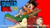
One suggestion is try to make your thumbnail original. It is easy to go to google, find an image and slap on some text. But the thumbnails that really sell are the ones where people take their time to make each aspect of the thumbnail stick out. (If the DBZ image is your original work, then I apologize. It looks good but you need to work on the text). Like some replies before me said, the white font is not sticking out. The simple solution to this is use word art and have a black border/outline on the letters and use white fill. This will lead to your text standing out.

If you want a great site to use, try canva.com. It is completely free and has an easy to use interface. If you decide to use it and need help, send me a private message and Ill try to help you the best I can.

Three tips I have are:
1) Make your purpose/title stand out from the rest of the background.
2) Use multiple images. Pick one background image then add some smaller ones in.
3) Increase saturation. Mess around with the filters.

Beside those things, the video looked great! Fun and interesting editing:)
 

logkentwigboy

New Member
Joined
Dec 29, 2017
Messages
4
Reaction score
1
Age
28
I usually try and find similar videos, that I make, and mimic their styles. There are alot of great youtubers out there and it really depends on how much effort you put in in each of your videos